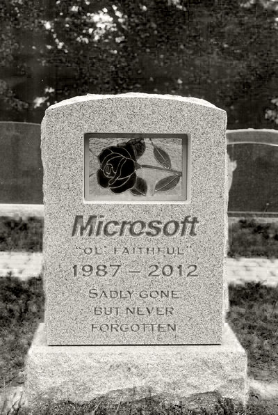
So Microsoft have officially unveiled their new company-wide corporate brand... And it's truly terrible.
 First impressions were that it looks like someone just opened Word 2010, typed the name in, added four squares and hit Save. Hideous! Even on repeat viewings, it's just abysmal.
I could just about tolerate MS turning all their web properties Metro to match the imminently-launched Windows 8... Not like I'll be using W8. But their classic, instantly and universally recognisable main logo? Eurgh. The clowns responsible for this better be preparing for the tons of scorn about to be ladled upon them.
For some history, here's the evolution of their logo...
So Microsoft have officially unveiled their new company-wide corporate brand... And it's truly terrible.
 First impressions were that it looks like someone just opened Word 2010, typed the name in, added four squares and hit Save. Hideous! Even on repeat viewings, it's just abysmal.
I could just about tolerate MS turning all their web properties Metro to match the imminently-launched Windows 8... Not like I'll be using W8. But their classic, instantly and universally recognisable main logo? Eurgh. The clowns responsible for this better be preparing for the tons of scorn about to be ladled upon them.
For some history, here's the evolution of their logo...
Continue reading "RIP Microsoft logo, 1987-2012"
 First impressions were that it looks like someone just opened Word 2010, typed the name in, added four squares and hit Save. Hideous! Even on repeat viewings, it's just abysmal.