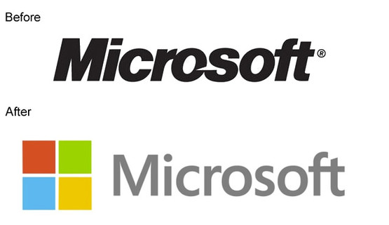
So Microsoft have officially unveiled their new company-wide corporate brand... And it's truly terrible.
 First impressions were that it looks like someone just opened Word 2010, typed the name in, added four squares and hit Save. Hideous! Even on repeat viewings, it's just abysmal.
I could just about tolerate MS turning all their web properties Metro to match the imminently-launched Windows 8... Not like I'll be using W8. But their classic, instantly and universally recognisable main logo? Eurgh. The clowns responsible for this better be preparing for the tons of scorn about to be ladled upon them.
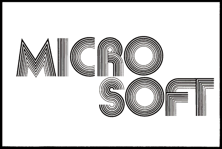
For some history, here's the evolution of their logo...
And then to the ubiquitous logo we all know and love admire are used to:
I'll let Pocket Lint take it from here.
Microsoft just lost an incalculably significant part of its identity and heritage, at a time when it needs to hold onto the affection of long-time users for all it's worth. For its distinctly retro feel, the classic oblique name in the bespoke typeface with the 'Pac Man' O carried so much weight and history - it remains an excellent brand to date. A monolithic corporate such as MS just changing its logo is like GE, Royal Mail or the BBC accidently dropping all their corporate artwork files into the Recycle Bin whilst surfing Tumblr drunk then cobbling together a new one in Drawsome. (At least when the BBC does rebrand, they always ease us into it gently whilst retaining an importance sense of respect for history. Lambie-Nairn always manage to expertly keep their brand fresh without forgetting its past, exactly how an agency should work alongside an organisation).
Now, the new Microsoft logo just feels like a Web 2.0 company logo... And a poor one at that. It feels 'weird' to look at - kerning's suspect, relative sizing of the logomark and typemark are just bizarre and the "ft" ligature is better suited to usage in print than it is a corporate headline.
What's unforgiveable is that they used Segoe! If they'd used Comic Sans MS it might have looked better.
... Ok, I take that back. But still, it's just not right. Whoever got paid for this must be killing themselves laughing. Now enjoy this video:
[tube]OzkZWvAJUr0[/tube]
Here's what Jeff Hansen, GM of Brand Strategy at Microsoft, has to say for himself:
The logo has two components: the logotype and the symbol. For the logotype, we are using the Segoe font which is the same font we use in our products as well as our marketing communications. The symbol is important in a world of digital motion (as demonstrated in the video above.) The symbol's squares of color are intended to express the company's diverse portfolio of products.
Starting today, you'll see the new Microsoft logo being used prominently. It will be used on Microsoft.com ”“ the 10th most visited website in the world. It is in three of our Microsoft retail stores today (Boston, Seattle's University Village and Bellevue, Wash.) and will shine brightly in all our stores over the next few months. It will sign off all of our television ads globally. And it will support our products across various forms of marketing. Fully implementing a change like this takes time, so there may be other instances where you will see the old logo being used for some time.
We're excited about the new logo, but more importantly about this new era in which we're reimagining how our products can help people and businesses throughout the world realize their full potential.
Posted by Jeff Hansen
General Manager, Brand Strategy, Microsoft
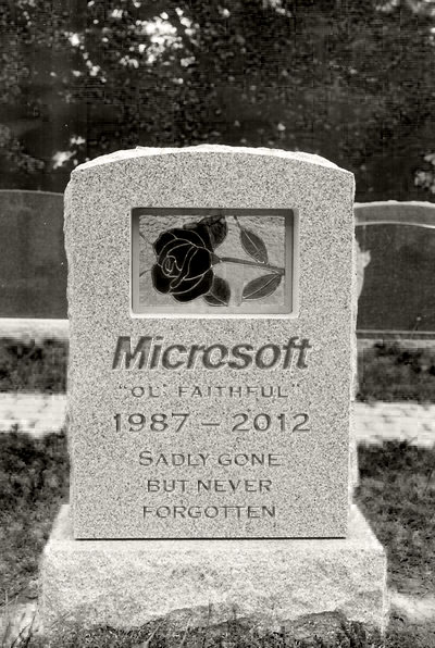
RIP Microsoft logo, we'll miss ya.


As much as I can't complain about the new logo, I don't get why they did it. The Microsoft Logo is just straight classic.
Exactly 🙁 Poor execution compounds what could have been an excellent brand update.
You missed out the 'blibbet' logo, used from 1982 to 1987.
It's immortalised, of course, by the unsuccessful "Save the Blibbet" campaign staged by several MS employees when the 'Pac-Man' logo was launched...
Shut up Christopher, Microsoft's new image is just great. You're just a hater.
Your portfolio site borrows heavily on the Metro style, I assume you're a fan of their rebrand... 😉